You are using an out of date browser. It may not display this or other websites correctly.
You should upgrade or use an alternative browser.
You should upgrade or use an alternative browser.
POTD = Characters
- Thread starter BB3126
- Start date

Here's a Pooh:

Roger's likely right. Mine isn't necessarily from the RAW processing - it's more in processing (whether in camera or on computer). At Disney, I tend to like slightly richer contrast and slightly higher saturation - it just seems to suit the mood, the scenery, the colors, and the atmosphere...and looks great in prints. Most of the time, I just boost saturation a tad in post processing (like Pooh above)...or as Roger mentioned I set my DSLR to 'vivid' which is essentially a +1 saturation in camera.
Last edited by a moderator:
prettypixie
Member
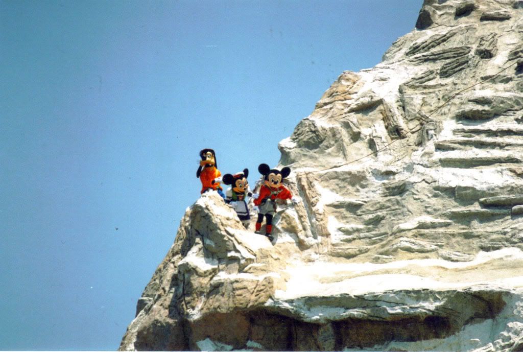
Here is one of Mickey, Minnie and Goofy climbing the Matterhorn at DL.
prettypixie
Member
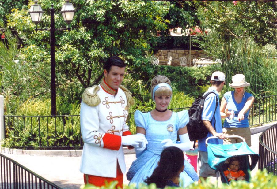
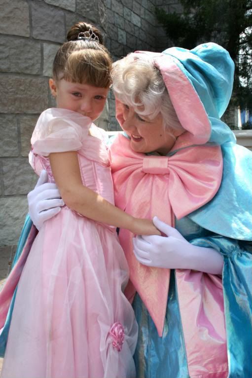
Another one of Cinderella and her prince. This is at DL and I realized he is wearing a different coat - if I remember correctly, this one is NOT as accurate to the original film.
prettypixie
Member
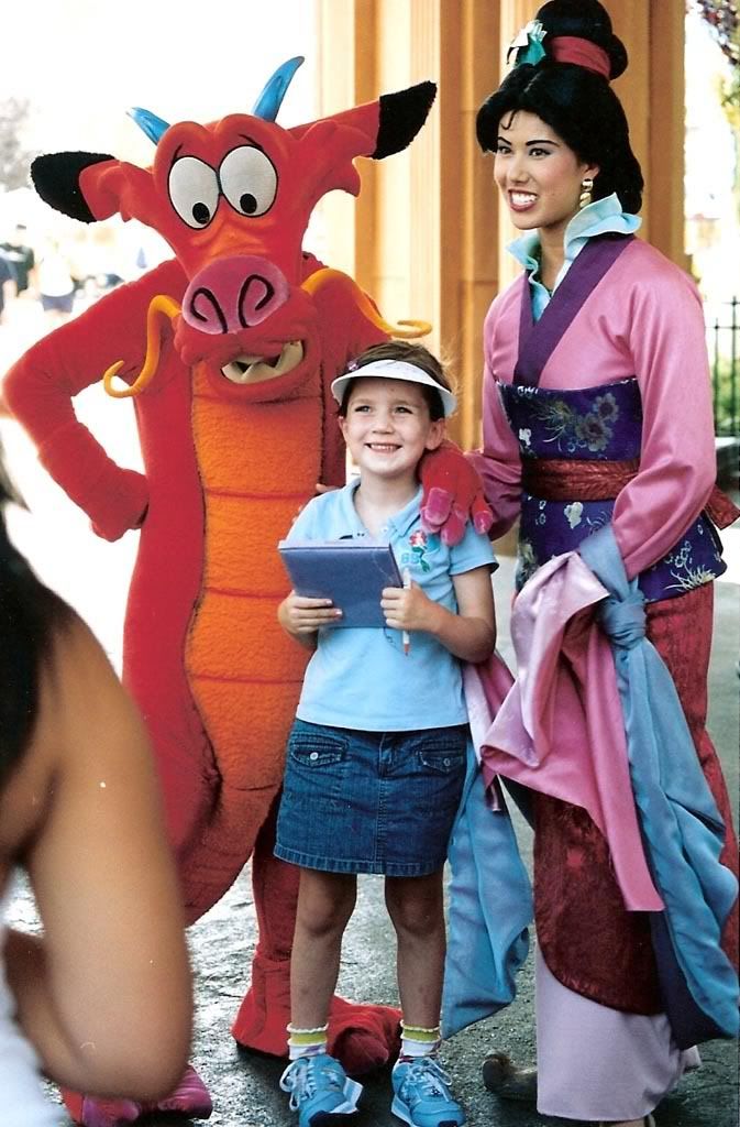
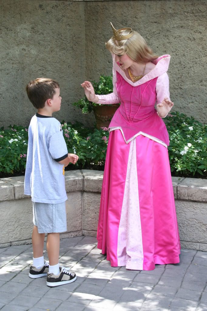
Here is another of Mulan with her pal...
prettypixie
Member
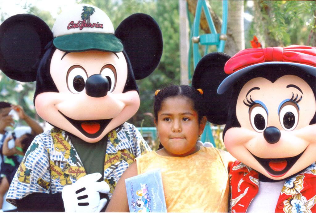
Here is one of Mickey and Minnie at DCA...

"zackiedawg" said:Roger's likely right. Mine isn't necessarily from the RAW processing - it's more in processing (whether in camera or on computer). At Disney, I tend to like slightly richer contrast and slightly higher saturation - it just seems to suit the mood, the scenery, the colors, and the atmosphere...and looks great in prints. Most of the time, I just boost saturation a tad in post processing (like Pooh above)...or as Roger mentioned I set my DSLR to 'vivid' which is essentially a +1 saturation in camera.
Thanks Zackiedawg & Roger for the advice. I'll have to give that a try.
Last edited by a moderator:

Goofy in the AK parade:

prettypixie
Member
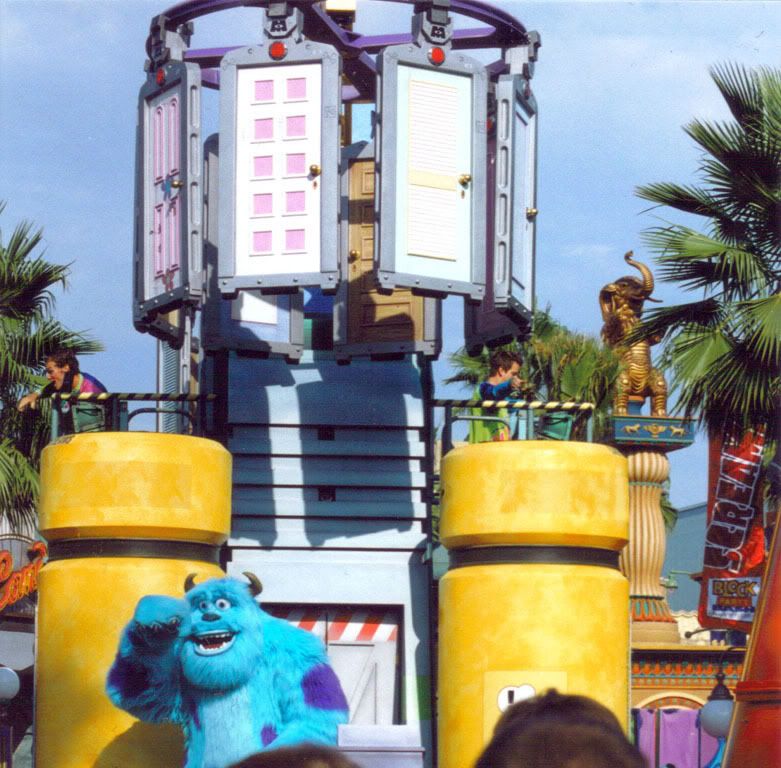
Here is Sully in the DCA parade @ 2005.