http://dan7790.photos.de.com/p25459988.html
Again, I can't be sure that link is going to work, I'm only using it because the picture is very large, well beyond the what can practically be posted in a forum.
Since I posted an Animal Kingdom Lodge panorama, I figured I'd put this one up too. I'm getting all critical of my work now and I'm not entirely liking this either, it's too dark, but the lights on the water are rather nice.
I've got some more pictures, and since I don't yet know any way to comment on each attached picture individually, I'll just say a few words and then post the lot.
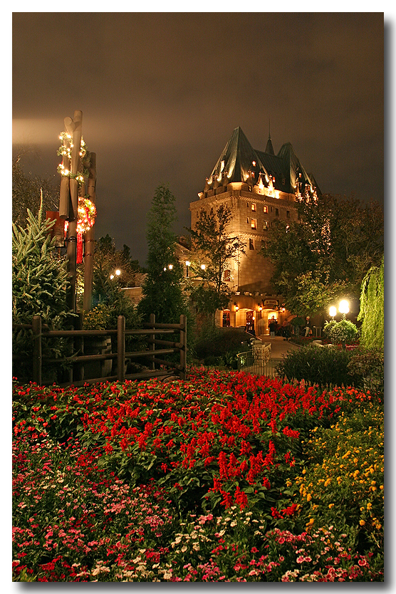
Night photography has always interested me, it's part of the reason I got into DSLRs (the combination of unlimited exposure length and low long exposure noise levels). And Disney World is in many ways the peak of artistic night lighting. I love that they're willing to leave some places relatively dark in order to enhance the atmosphere, rather than just blasting flood lights everywhere.
In 2004 I spent a night at Epcot on a photography mission. Basically I rode Mission Space at least 4 times (because the line was just nonexistant) and did a few Test Track rides, and otherwise spent all my time taking pictures of the place, actually focusing on closed attractions at times. I felt kind of odd wandering around otherwise abandoned areas, on the hunt for convienent trash cans which I could place my mini tripod on.
I lack the post processing finesse to bring out the full potential in these shots. I just don't know how to adequately balance the light and the darkness. But I've done the best that I can.
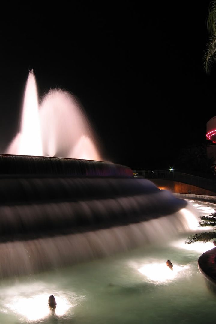
I have extreme difficulty handling Imagination, the fountain comes out nice but the structure behind it ends up shrouded in darkness. Basically I think I need to start making at least two different exposures and then blend them in photoshop, but my early attempts at that technique have been failures.
And as for the Living Seas.. that'd be a really nice picture of that trash can hadn't been placed so prominently right in the middle.
I like the Spaceship Earth one though. Well.. I'm not totally sold on the color balance, I think I made it way too blue.. I've been struggling to figure out exactly what color Spaceship Earth should be at night. I think I've decided that it should be a lot more purple since the time that I made this picture.
[This attachment has been purged. Older attachments are purged from time to time to conserve disk space. Please feel free to repost your image.]
Last edited by a moderator:


